The Promenade
Type: Personal Project
Development: March - May 2021
Description: “The Promenade” is a FPS multiplayer map that takes place in a scenic Mediterranean port town called Paume. The game mode in this level is Conquest with two teams both with 5 players trying to take control of 3 flags. The level has a symmetrical design that takes into account of special abilities like flight and certain guns like snipers to make domination both fair and fun.
Purpose: The purpose of this level was to go through the entire development pipeline of a level from research, to designing its layout, to 3D modeling its proxy whitebox art in Maya, to replacing the proxy with actual final art assets. The other purpose was to understand and replicate the design process of a PvP map how to create a symmetrical level design that benefits and hinders both teams. Understanding concepts like conflict points, choke points, loops, flow, etc.
Tools Used: Unreal Engine 4, Maya, Blueprints, Photoshop, Illustrator

Gameplay Video & Image Gallery
Playthrough: Red Team (Delta) vs Blue Team (Sigma)
Walkthrough: No Enemies Just Walking Through the Level

Digital Layout & Concept
The initial start to the creation of this level was to do a ton of research into the genre I was going to make. I used Photoshop and PureRef to draw and compile a list of all my research to the point that I can draw the initial pass of how I would like the layout of the level to be like.
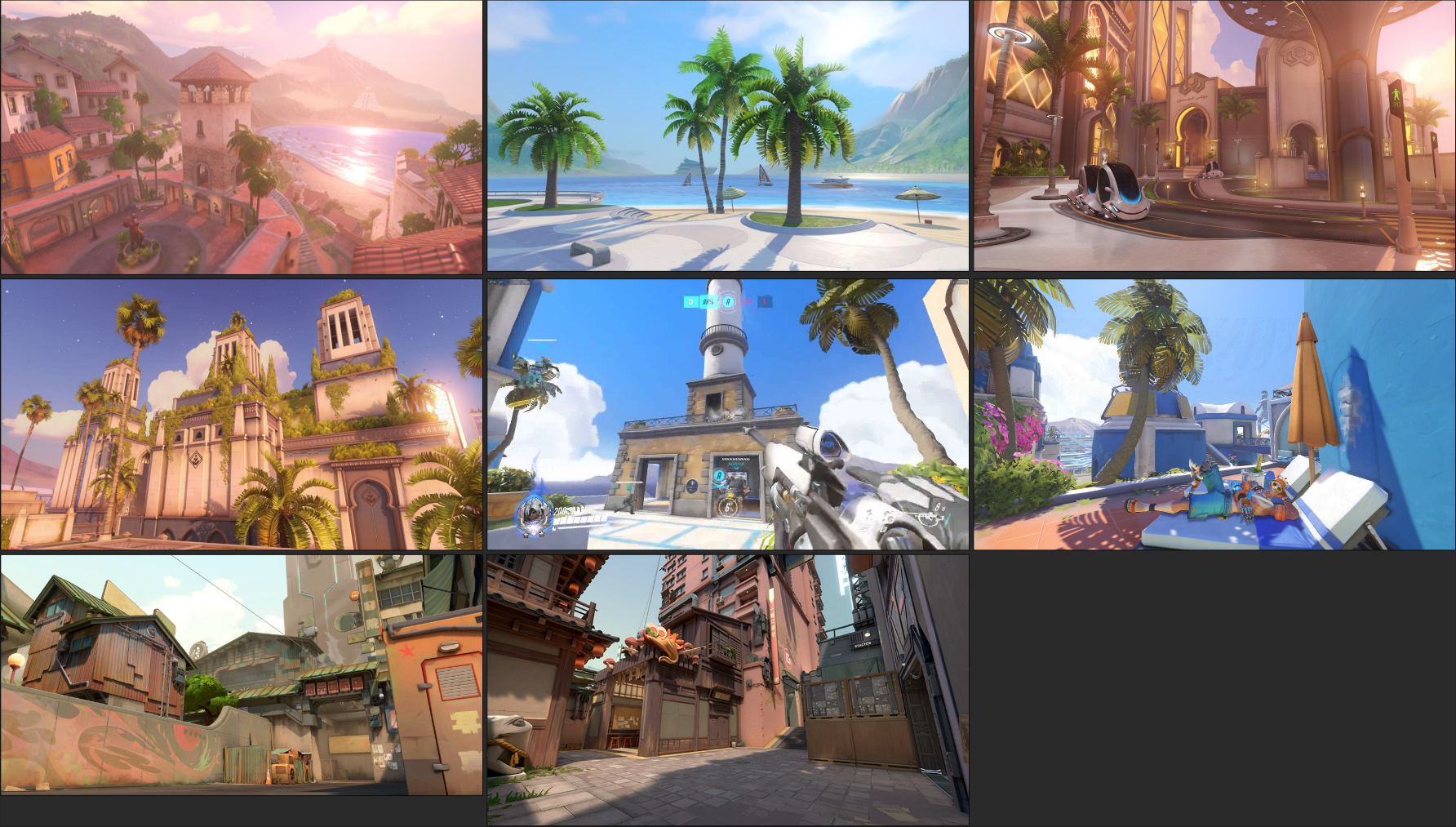
Call of Duty, Overwatch, and Valorant was chosen as my main inspirations for the love due to both my love of how they mix real world locations into a level and their unique style of level design. Both games have abilities that take into account the design of the levels whether its flight or abilities that will let players be more confrontational. In the base of the design there needed to be many loops for players to take that way teams can disperse players all throughout the level which will allow for more confrontation. Each spawn is close to its own flag and also in a safe location so spawn camping can’t occur.
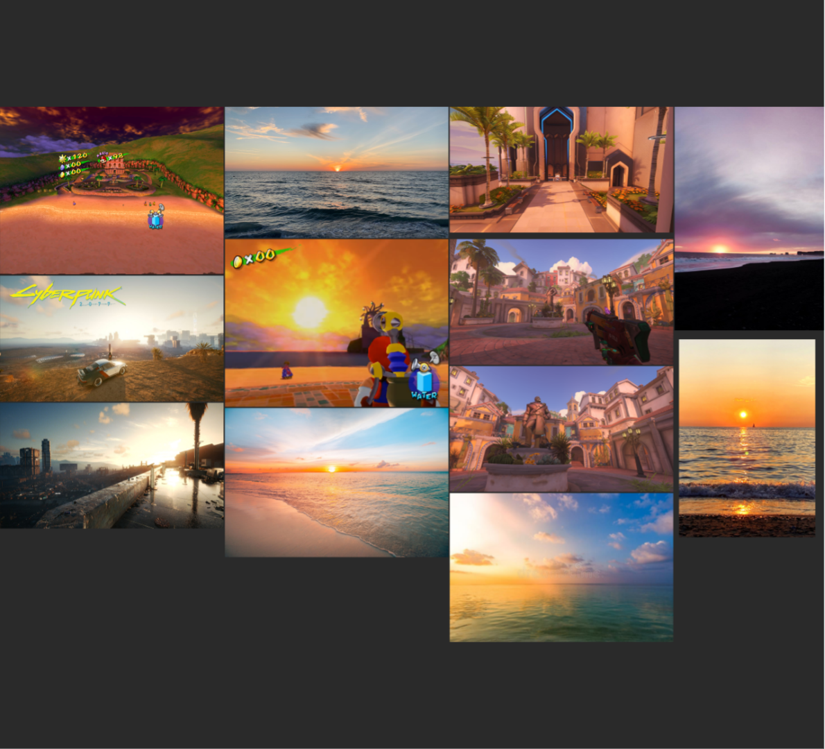
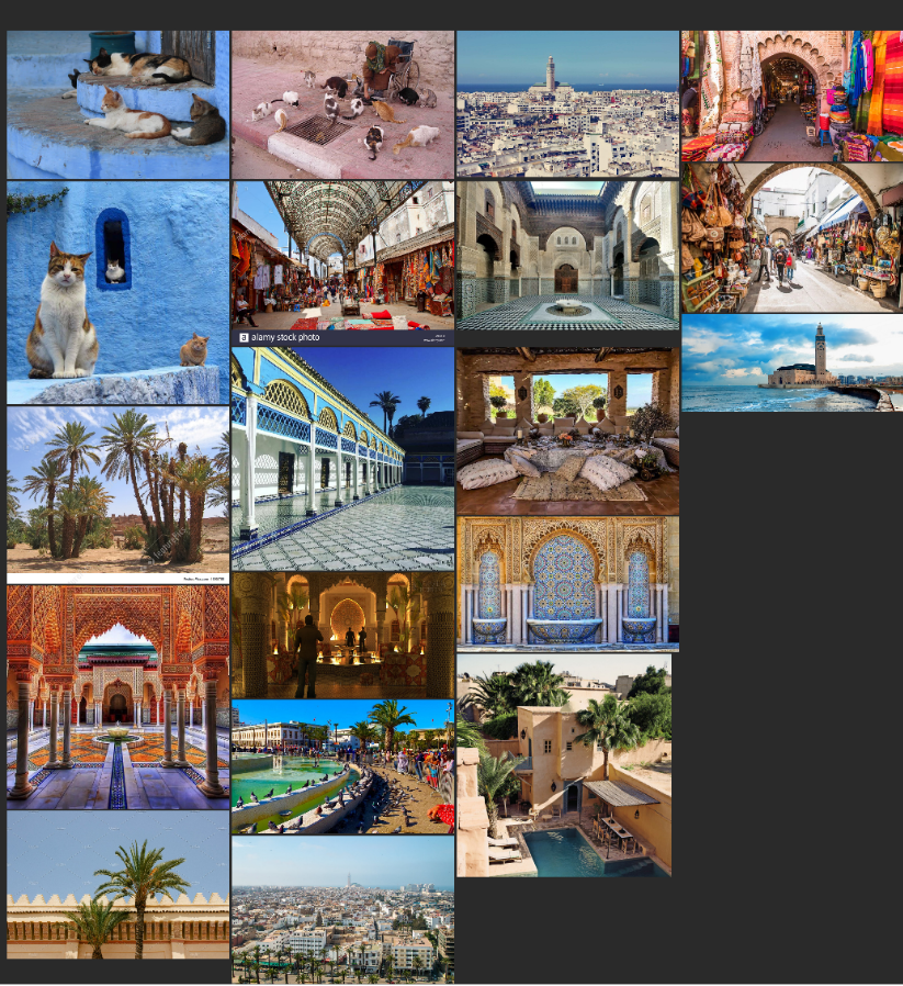
The aesthetic of level is established to be a relaxing port town that’s overlooking the ocean. The made up town which is named Paume (French for Palm like a Palm Tree) takes inspiration from both French architecture and Moroccan architecture with some influences from other Mediterranean nations.
Initial Layout
Current Layout
Overwatch and Valorant Inspiration
Lighting and Sky Reference
European Influence
North African Influence

Whiteboxing
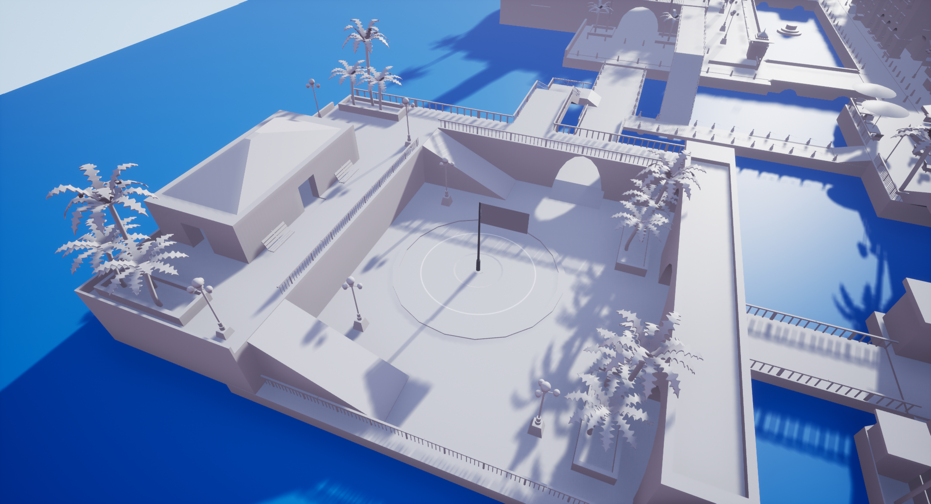
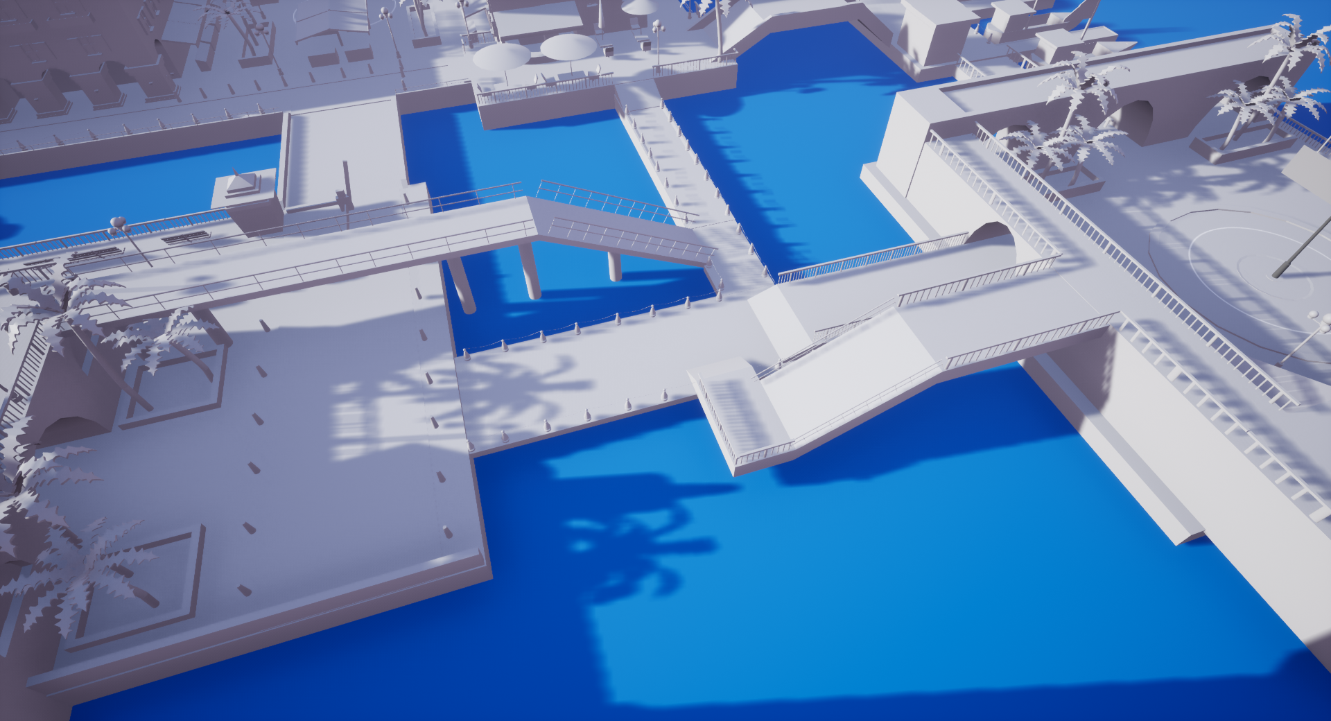
Whiteboxing was the next phase in the level design process. To get a sense of scale I started off by importing the UE4 mannequin into Maya to establish a sense of scale. During the whitebox phase I really wanted to play with the initial mood of the level and its more important mechanics. The level’s design during the whitebox phase actually was reduced in overall expansiveness to encourage more confrontation between the two teams. It also added more verticality to than the original layout designed for. The whitebox allowed me to work with handling collisions creating blueprints about the ocean killing and respawning you, editing the asset packs blueprints to take away fall damage and boost the power of abilities.

Blueprints
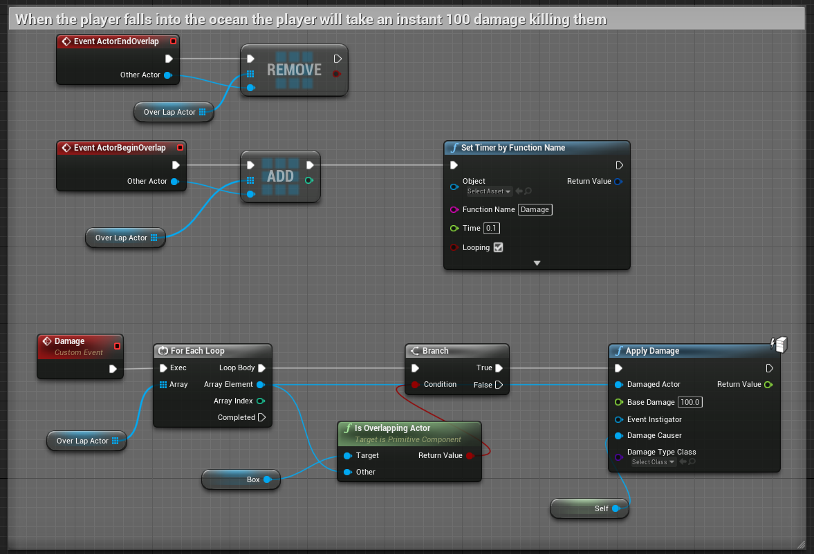
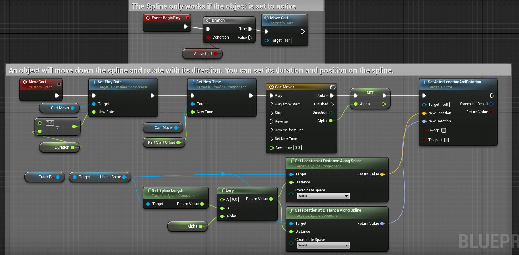
For this level I created two major enviromental blueprints and altered the mechanics blueprint for the FPS asset pack. For this level I made the BP for the Ocean to kill you if you land. If you used a normal kill volume the player will never respawn in the match so a BP that did damage had to be applied. The other BP I made was a spline so that a cruise ship that follows my spline can swim across the background of the level.
Ocean Blueprint
Spline Blueprint

Playtesting (Whitebox )
Once the whitebox was completed and certain mechanics were implemented the first round of playtesting was able to start. The first rounds of playtesting involved 8 people in total playing a 4v4 match and then a 3v3 match with 2 people sitting out. After the initial rounds of matches were over they were able to roam freely in the level to give feedback.
Major feedback that was found was that the map felt imbalanced to towards the Red team having an advantage. The C flag which is closer to them was super easy to defend to the point the Blue team couldn’t capture it. The A flag which is near the Blue team felt balanced but the Blue team could easily run to the B flag while the Red team couldn’t. This plus the addition of the both teams being able to be spawn camped and immediately killed after spawning into game. Pros of the feedback was they liked the vibe of the level, the level design to fit with the flight mechanic, and felt the B flag was the most fun conflict point in the whole map. The map also felt like it comfortable at 4v4 but could support 5v5 if some rework to the layout occurred.

Set Dressing
Since the level is first person the player’s eyesight will always be focused on what’s ahead of them. Due to that attention to detail must be present to make the environment feel more alive and like an actual town. Creating splines to have cruise ships in the background that move to give motion to the skybox. Using vertex painting to make the ground have reflective water near fountains and seafoam near the piers. Having some cats in the market and vegetation in the windows and gardens to really sell that this town is lively on that. The set dressing is not overboard to the point that players can get overwhelmed because the pathing were not clear on where to go or assets obstructing player’s views.

Optimization
A major part of the level being enjoyable is optimizing it especially with a PvP. The level must run at a consistent 60 FPS and for this to happen many things had to happen mainly on the collision side. A lot of the objects on the level that the player has no access to has no collision at all. Certain objects have simple collisions or some buildings its just a thin blocking volumes. Due to the time of the level being in sunset additional lighting had to be added. I had to make sure the attenuation radius were large enough so the light reached the ground but not too large that they intercepted with near by lights.
Marketplace: Normal Mode
Marketplace: Lightmap Density
Marketplace: Light Complexity
Marketplace: Player Collison
Garden: Normal Mode
Garden: Lightmap Density
Garden: Light Complexity
Garden: Player Collision
Backstreet: Normal Mode
Backstreet: Lightmap Density
Backstreet: Light Complexity
Backstreet: Player Collision
Island: Normal Mode
Island: Lightmap Density
Island: Light Complexity
Island: Player Collision

Playtesting (Final Art)
Once the final art was completed and all adjustments to the whitebox were completed the next rounds of playtesting were conducted. The group was mixed with both human players and smart AI to allow an equal amount of players for each team.
The feedback was majorly positive with majority mentioning the fixes that occurred from the whitebox playtesting. The level felt significantly more balanced for both teams with outliers mentioning the Blue team might having a slight advantage. The lighting was bright enough to navigate through, major comment is the level was beautiful from the lighting, to atmosphere, and the use of assets. Playtesters loved the quality of the level felt it could fit aesthetically in an actual game map. They all mentioned there was nice use of cover throughout the map. Certain areas were less utilized than expected like the backstreet of A flag and the Upper Floor of C building. The art was not distracting to the player which was another plus. No major collision issues occurring in the level with no major lag occurring throughout the level.

Lessons Learned
Making this level was very enjoyable experience as it was a level that I really wanted to break out of my comfort zone.
First Person - Having a level be in first person meant I really had to make sure I understood the scale of the assets so everything didn’t feel too large or small.
Modularity and Asset Packs - Being able to create structures with modular assets and making a cohesive level despite the use of many different asset packs.
Multiplayer / Conquest Map - Designing a level that not only had to be balanced and symmetrical for two teams, but creating enough paths that encourage conflict and rest for 10 players on one map. At first it seemed daunting but over the course the design felt natural and easy to consider in making the level.
Optimization - Seeing how much collision can completely affect the FPS of a level. Creating artificial blocking volumes, using more simple and no collisions. Continuing this process until all collisions both allowed the player to be at 60 FPS and having the collision still feel natural to the player.
Overall - A lot of things that I learnt from the Swamp level got incorporated to this level. Now this level I feel like is a showcase of my strongest attention to the design of a level from flow and navigation. Aesthetically I love the level feel like it captures the design of the games I was trying to emulate even with the limited access to asset packs.


